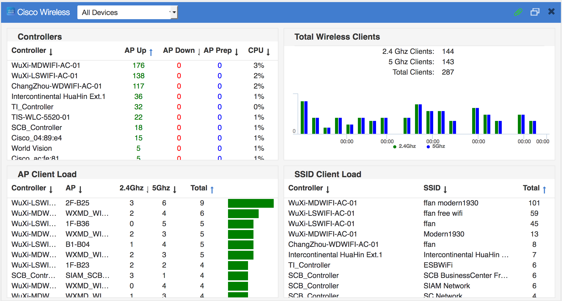
Create an Outage Map
In this chapter, you’ll learn how to create and use Outage Maps. An Outage Map is a graphical representation of the status of the Sites in your organization. Using real world maps and GPS coordinates, an Outage Map instantly shows you outages for any of your Sites in any region of the world.
This chapter covers how to:
- Obtain and Configure a Google Map API Key
- Create an Empty Outage Map Dashboard
- Place Sites on the Outage Map
- Configure Outage Map Parameters
Obtain and Configure a Google Map API Key
Nectus needs an API key to work with Google Maps. Obtaining a Google Map API Key is outside the scope of this guide. Google provides detailed instructions for obtaining a key at:
https://developers.google.com/maps/documentation/javascript/get-api-key
Once you acquire a key, follow these steps to configure Nectus to work with your key:
- To open the Map Integration dialog, go to the Nectus Top Menu and navigate to: Settings -> General Settings -> Map Integration.
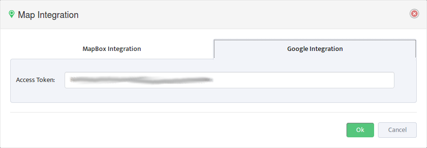
- Enter your API Key on the Google Integration tab.
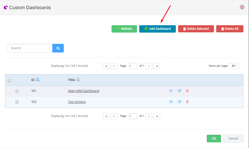
2. Create an Empty Outage Map
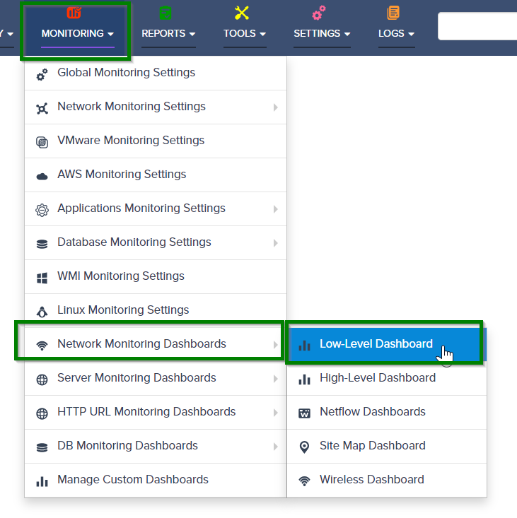
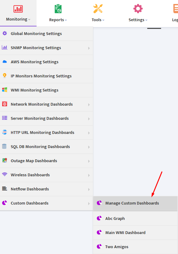
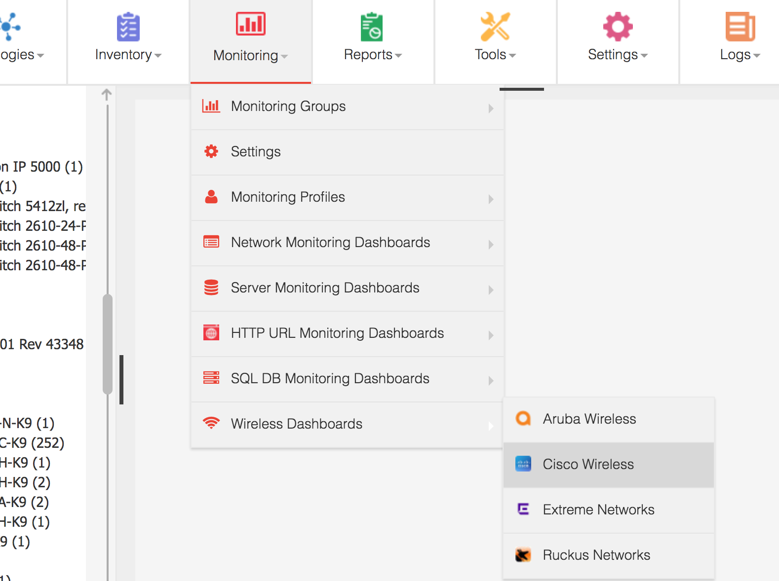
To create an empty Outage Map, go to the Nectus Top Menu then navigate to: Monitoring -> Outage Map Dashboards -> Outage Map Dashboard.
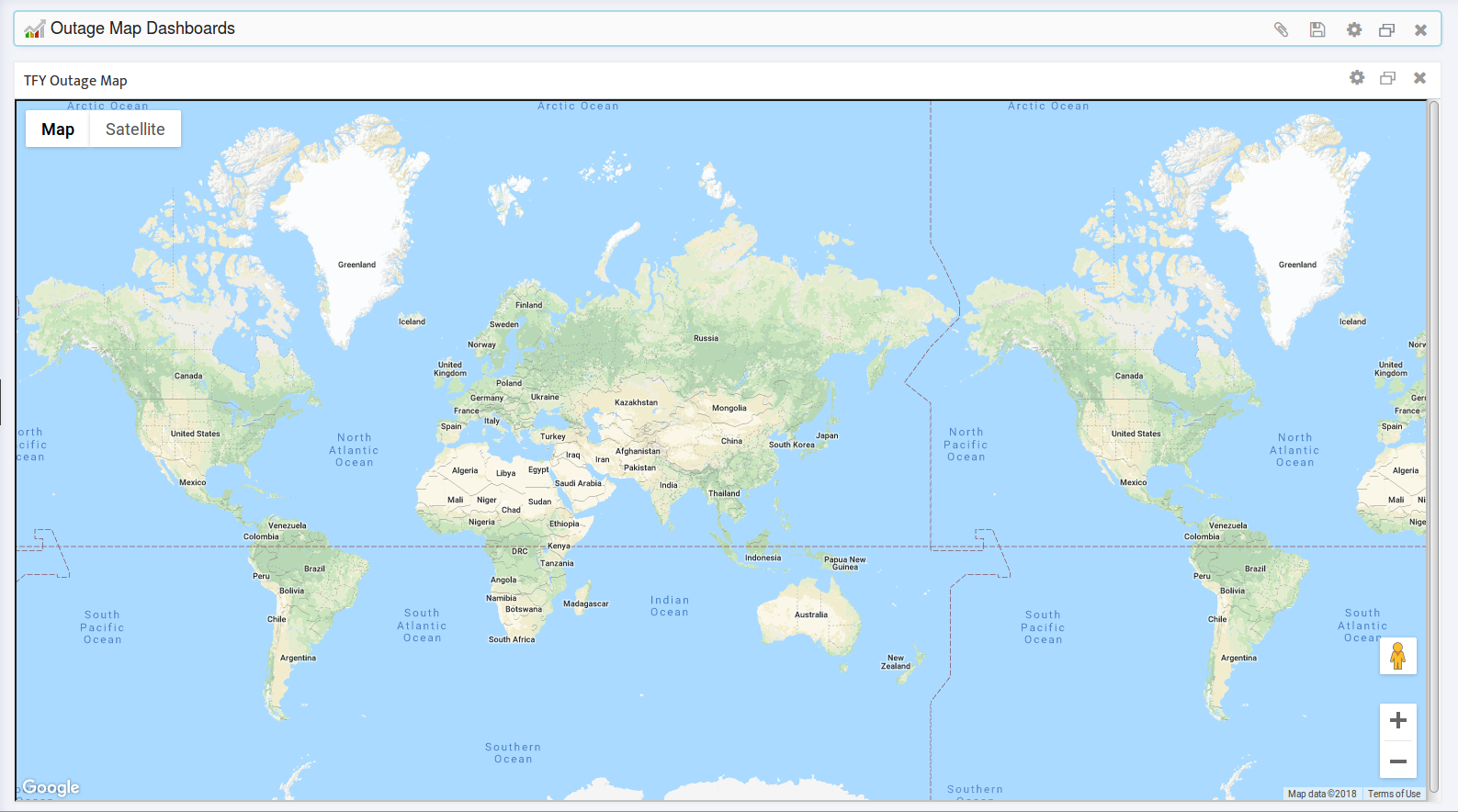
Note: Nectus supports up to 10 maps and can display any or all of them simultaneously. See Section 2.3 for instructions on creating and displaying additional maps.
2.1 Zoom In to the Geographical Area of Interest
- Zoom in to the geographical area you are interested in.
- Click Save on the Outage Map Dashboard so Nectus will open this map to this geographical location in the future.
2.2 Assign and Save a Map Name
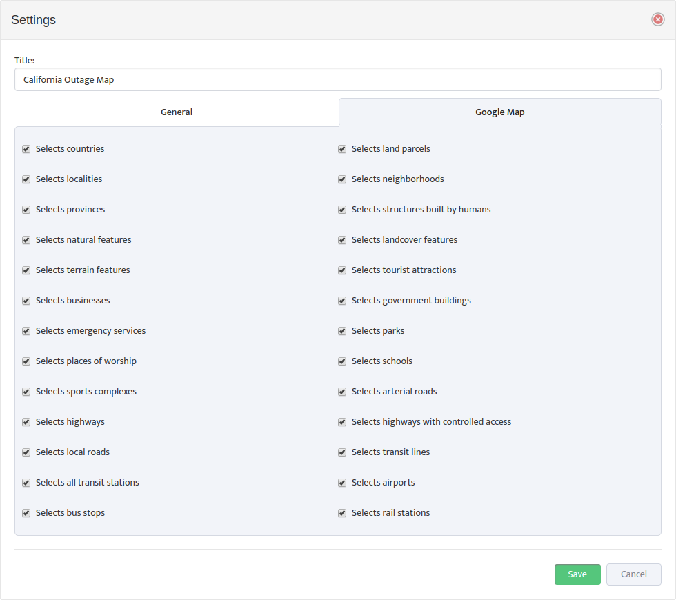
- To assign and save a name, click the map’s Settings button to open the Settings dialog.
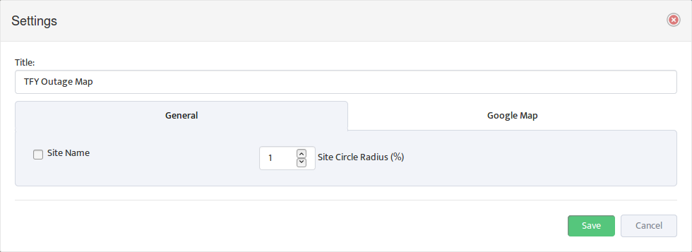
- Enter the new name in the Title field.
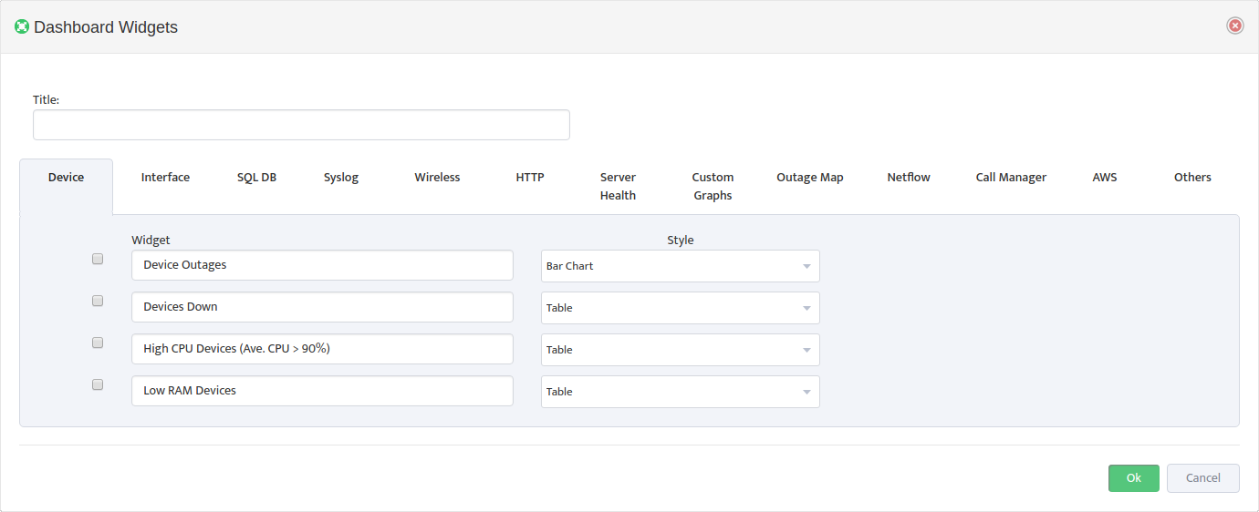
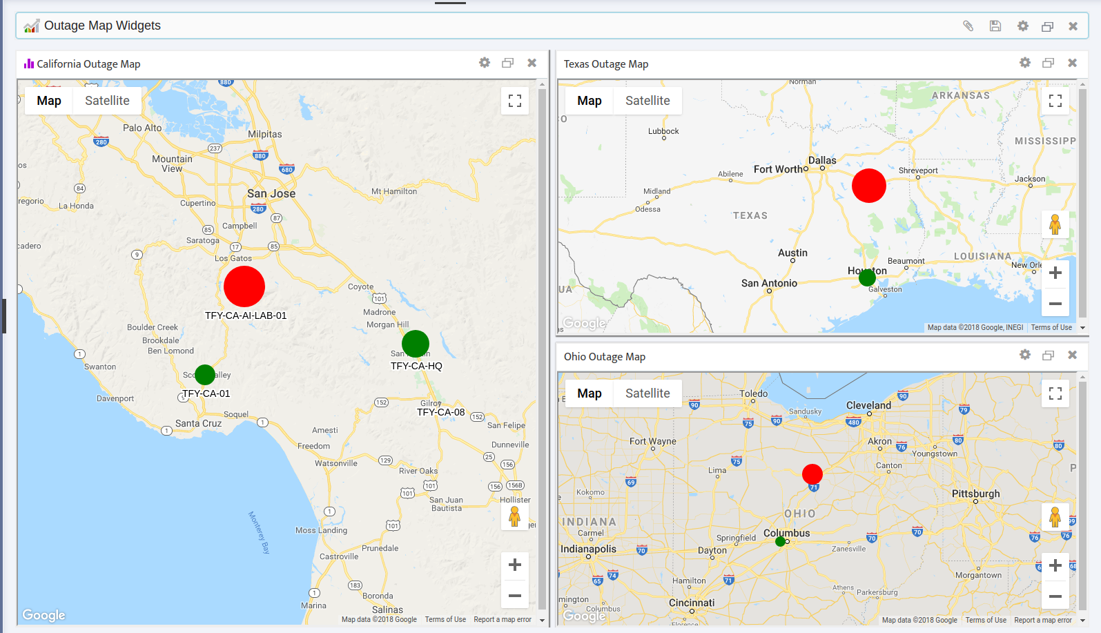
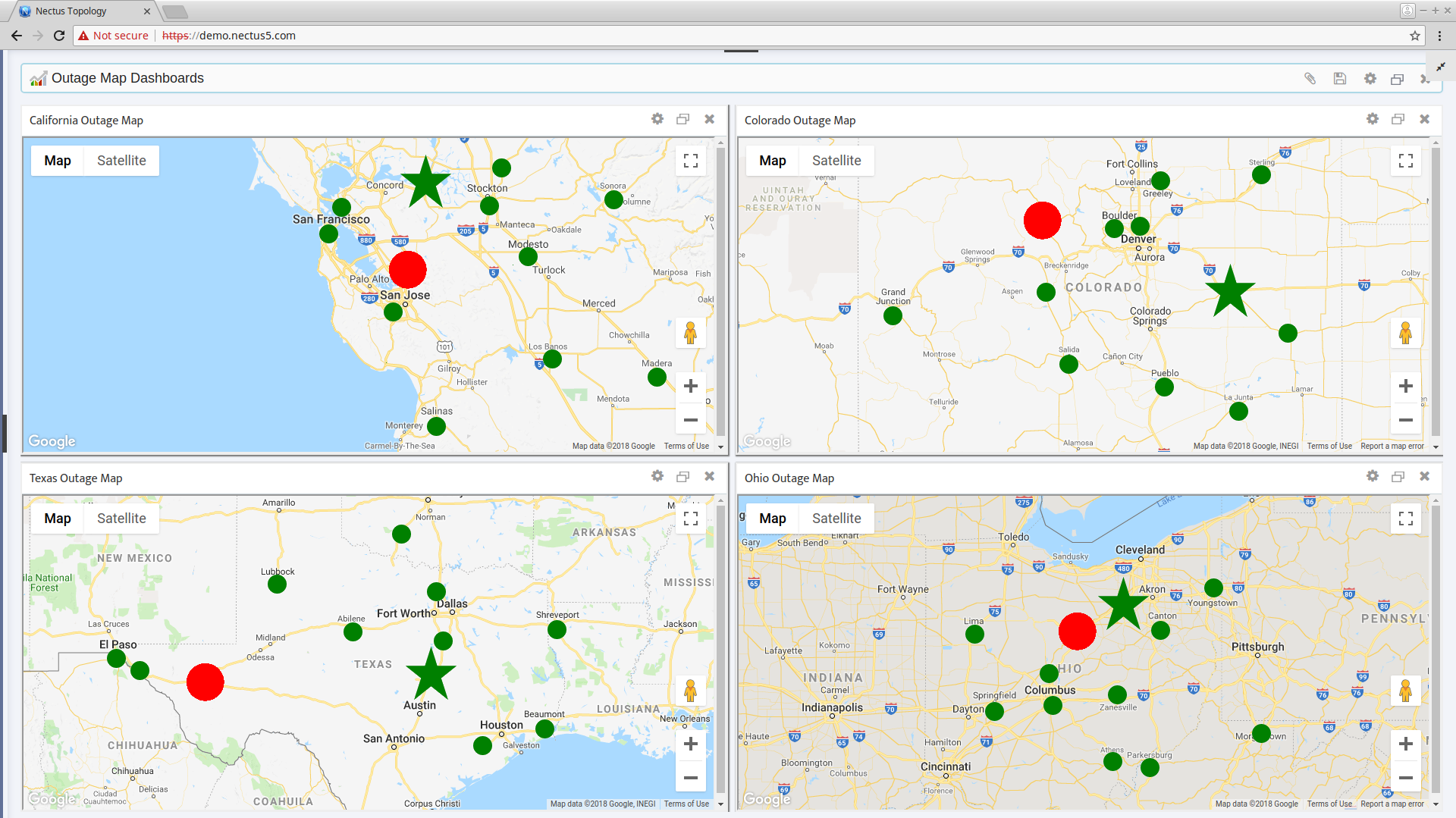
2.3 Display Multiple Maps Simultaneously
It can sometimes be helpful to display multiple Outage Maps simultaneously. Nectus can display up to 10 maps at once. Each map has its own adjustable settings and can be zoomed and configured independently.
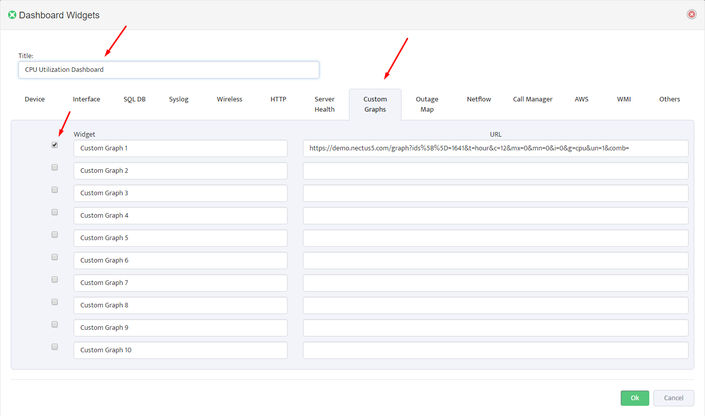
- To display multiple maps simultaneously, open the Dashboard Widgets dialog by clicking the Outage Map Dashboards Settings icon. Select the Outage Map tab.
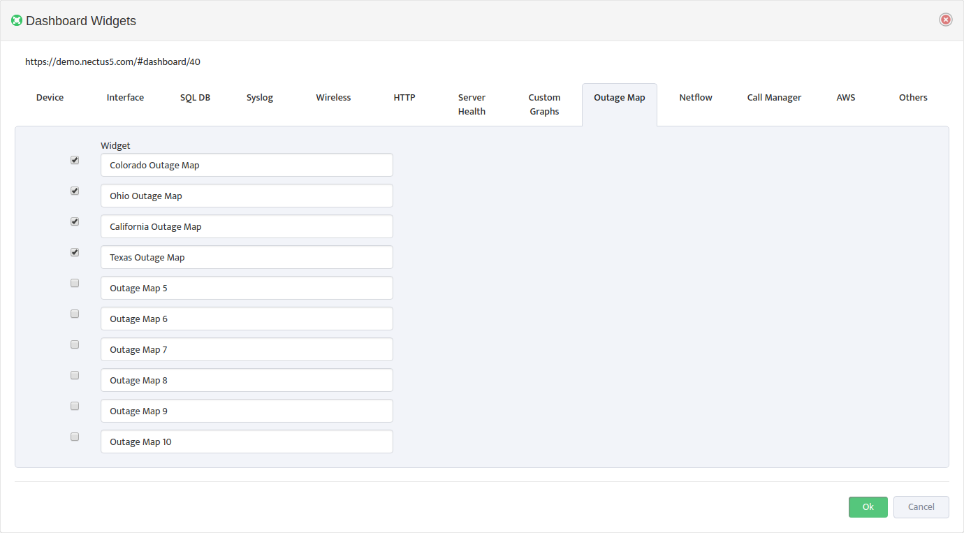
- Check the Outage Maps you want to display. You can also edit their names here if desired. Nectus displays all the checked maps.
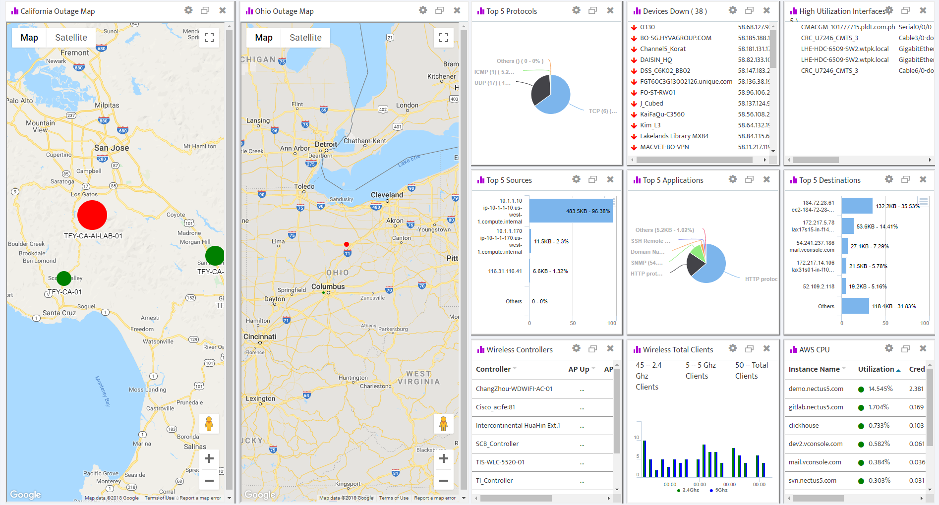
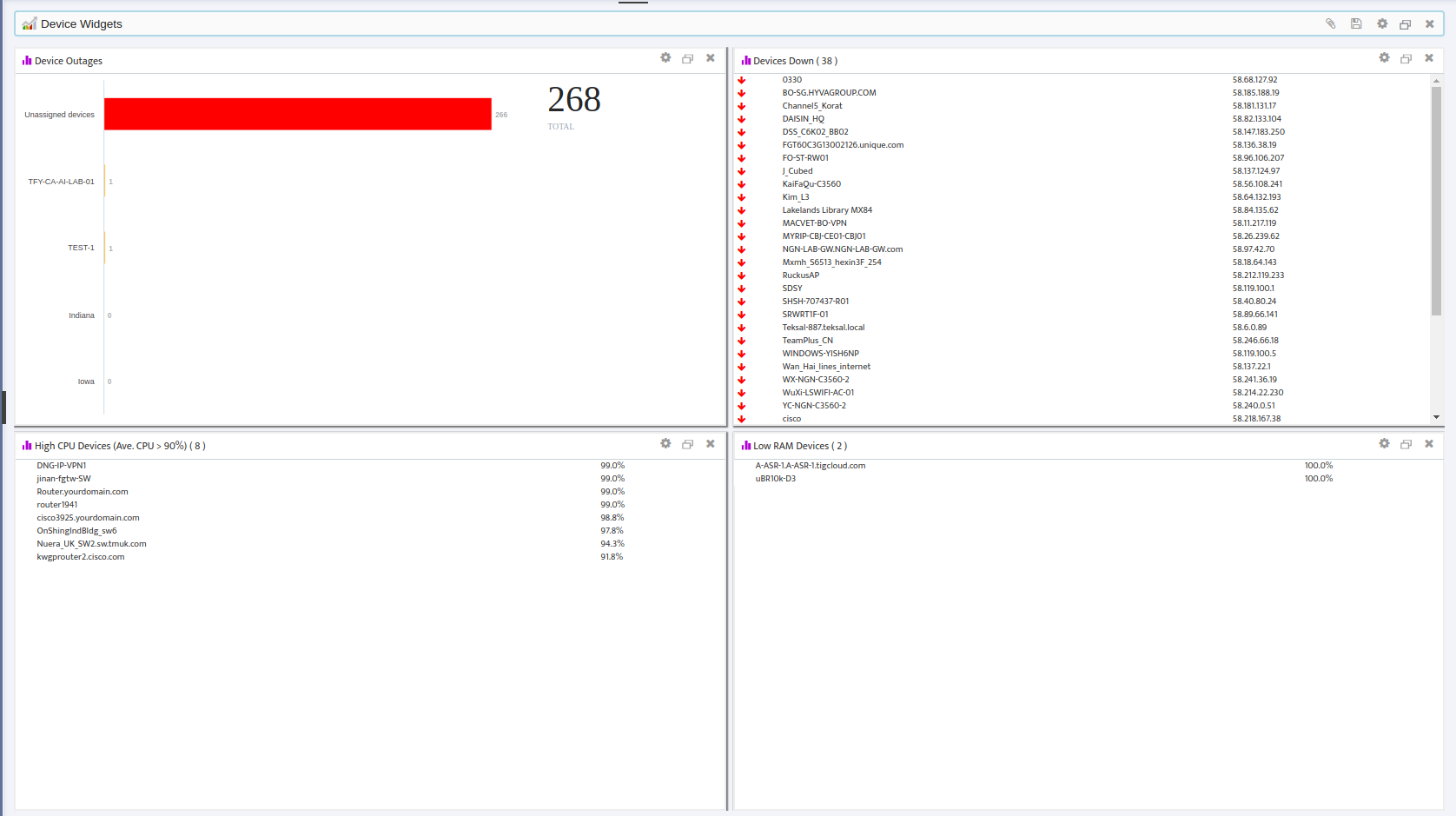
3. Place Sites on the Outage Map
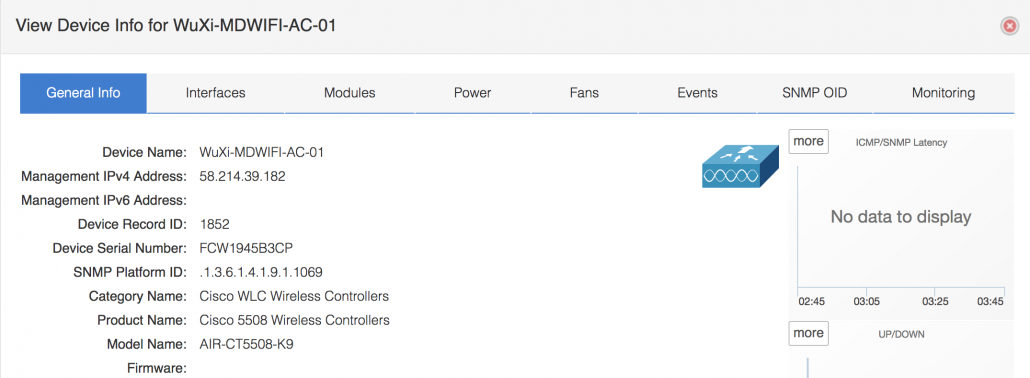
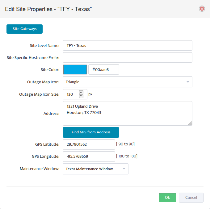
To place a Site on the Outage Map, you need to enter the GPS coordinates in the Site Properties. You can either enter the coordinates manually, or you can let Nectus derive the coordinates of the Site from its Address.
3.1 Enter the GPS Coordinates Manually
Enter the GPS coordinates in the GPS Latitude and GPS Longitude fields.
3.2 Derive GPS Coordinates from the Address
If you don’t know the GPS coordinates of the Site, enter the Site Address and click Find GPS from Address. Nectus derives the GPS coordinates from the Address and enters them for you.
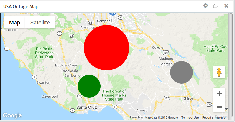
3.3 Understand Site Colors
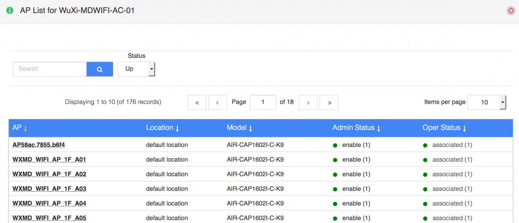
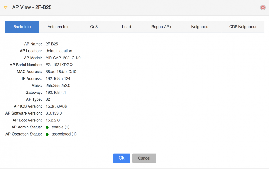
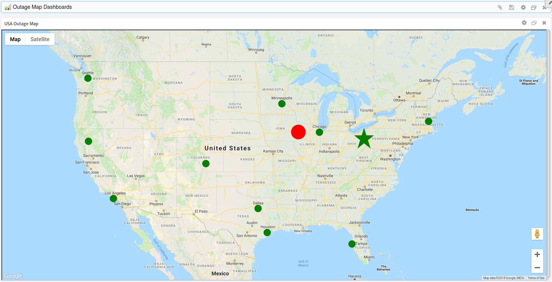
The color of a Site’s icon on the map gives you an easy way to check the status of the Devices at that Site. Each Site icon can have one of three colors:
- Grey – The Site has no Devices assigned to it.
- Green – All the Devices assigned to the Site are “Up”.
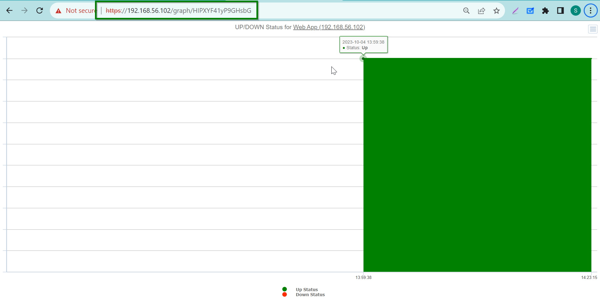
- Red – One or more of the Devices at the Site is “Down”. When a Site goes Red, Nectus also increases the size of the Site icon to help you spot it more easily.
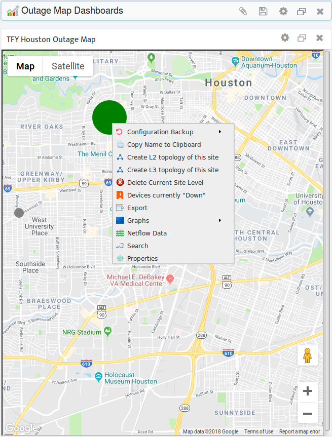
3.4 Access a Site Context Menu from a Map
If a Site appears on a map, you can open its context menu directly, without having to navigate through the Sites Panel. Simply right-click the icon of the Site.
3.5 Removing a Site from a Map
To remove a Site from any and all maps without removing the Site from the Nectus database, clear its GPS coordinates in its Site Properties.
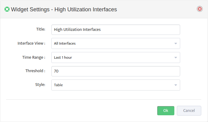
4. Configure Outage Map Parameters
An Outage Map has several configurable parameters that control how things appear on the map. You can configure each map independently of the others, giving you maximum flexibility to get exactly the information you need. The following sections show you how to configure these parameters.
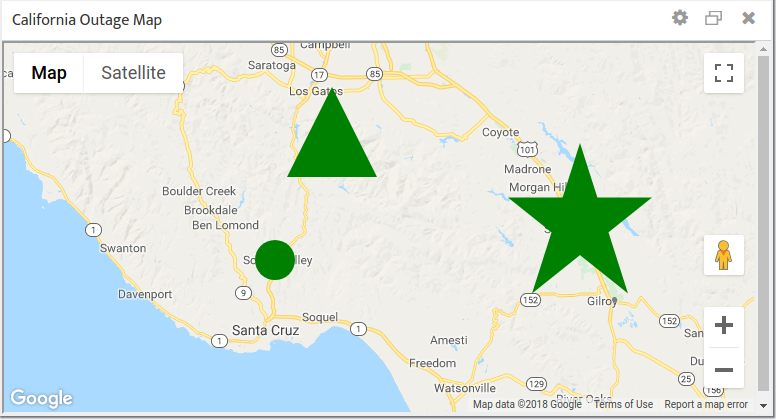
4.1 Change the Shape and Size of Individual Site Icons
Changing the shape or size of certain Site icons makes it easy to pick out those Sites on a crowded map. You might make your most important Sites larger than the rest, or assign them a different shape.
To change the shape and size of individual Site icons, navigate to Site Properties. In the Outage Map Icon Size field select the icon size in pixels. Use the Outage Map Icon list to select a Circle, Star, or Triangle for the shape.
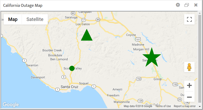
4.2 Change the Size of All the Site Icons on a Map
To scale all the icons on a map simultaneously navigate to: Map Settings -> General tab. In the Set Circle Radius (%) field enter a scaling factor that will apply to all the Site icons on this particular map. The following figure shows the map from section 4.1 with the icons scaled down to 50% of their original size.
4.3 Show or Hide Site Names
Every Site must have a Site Level Name, but you control whether Nectus displays those names on a map.
To show or hide all the Site Level Names on a map simultaneously navigate to: Map Settings -> General tab and check or uncheck Site Name.
4.4 Display of Hide Map Objects
Outage Maps can display a huge amount of information, not all of which may be useful to you. You can configure a map to display only those objects that are relevant to you.
To show or hide all the Site Level Names on a map simultaneously navigate to: Map Settings -> Google Map tab. Check or uncheck Map Objects as desired.